The Superiority of The Swoosh
- Theo :) :)

- May 8, 2020
- 3 min read
Alright, class, we’re starting with a hands-on activity: go search “Adidas ad” on Google images real quick. What did you find? Probably nothing special. Pictures of people looking athletic, maybe doing something creative. Now google “Nike ad:”. Interesting, huh? A few similarities, sure, but also clear differences (and way more memes). Maybe this exercise got you thinking about how much more memorable Nike’s ads tend to be compared to Adidas’ ads. In short, it’s because Nike is a tech company, unlike Adidas or any of their sportswear competition, and the way they sell things is a reflection of that. Sure, they peddle cheap athletic apparel, but that’s just a means to an end for them. The main focus is actually inventing groundbreaking materials, developing apps that enhance your day to day life... and even going to the extent of dedicating a portion of their own news site to “Innovation.” So I wanted to take a quick look at how Nike embodies these characteristics in their ads.
It isn’t unreasonable to think that Nike comes up with ad campaigns, like the Dream Crazy one (that’s the Kaepernick one) you saw in your search, on their own. They seem so... Nike-like, right? Well, that’s because their brand identity has been carefully crafted over decades with help from W+K. Wieden + Kennedy, which is actually the world’s largest independent advertising agency, got their start working with Nike about four decades ago. W+K’s work includes the “Just Do It” slogan, the now-infamous Dream Crazy campaign, the Play for the World campaign (which you might have seen on your own recently), and many many others. Nike is a noteworthy W&K client: among massive companies like Netflix, HP, and Uber, the brand stands alone as an apparel vendor. Maybe Nike has some sort of deal with Wieden + Kennedy that forbids them from working with competitors, or maybe those same competitors aren’t interested in W+K’s services. Regardless, Nike’s inclusion on their client list coheres if you perceive them as a technology manufacturer, rather than a sportswear brand.
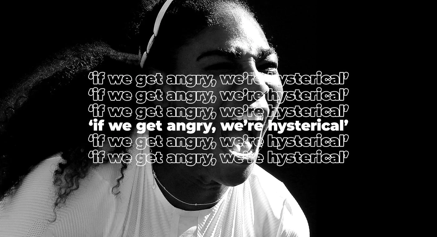
Nike doesn’t just share a partner with notable tech companies, but also advertising campaign tactics, which fundamentally separate Nike from its peers in the sportswear and fashion industry. Going back to the comparison between Nike and Adidas ads, as you scrolled through the scores of Kaepernick meme parodies, you might not have noticed that the most popular Nike ads don’t put a product front and center. There are definitely more direct ones, but many of them focus on the conceptual rather than the concrete. For example, the top ad above is a quote from Serena Williams about women in tennis being treated differently for expressing emotions the same way men do in the sport. The latter ad was created for the Chicago marathon, detailing the journey a running enthusiast makes to become a marathon regular. They’re both relatable and convincing in their use of language. The more you see them, the easier it is to believe that these messages are part of Nike’s core values.

Adidas’ imitation of this ad style is immediately transparent. Notice that the majority of these Nike ads are devoid of color, and often opt to make use of full sentences. Due either to an attempt at differentiation or a lack of understanding, Adidas counterparts are usually colorful and bright, with short taglines. As a result, they don’t seem serious at all; it’s hard to resonate with something that appears so corny. They don’t make you think about anything besides product placement and celebrity endorsement.
The same goes for similar ads from brands like Puma and Under Armor:
In short, Nike’s version of the ads are successful because they’re visually convincing. There are so many variations of these ads that they form a sort of belief system about the unique values that Nike represents as a company. See enough of them, and it’s hard not to believe that they actually stand behind what they’re saying; it becomes embedded in your mind. To achieve similar results, tech giants like Apple and Google do the same thing (though their exact methods vary). Think about it: Statements made in iPhone and Macbook ads have a certain quality that gives Apple a distinct appearance. It makes details about their product’s specifications more palatable and easier to retain. It’s marketing that is not only designed to sell products, but also to keep them separate from the rest in your brain. Personally, this advertising approach has been pretty effective on me when it comes to Nike. I don’t know about you, but I picture them as a cut above the rest - and this notion is not based on the quality of their product, but the quality of the way they sell it. There’s some food for thought for the next time you see a Nike ad and can’t put your finger on why it sticks out. You can thank me later.
_edited.jpg)


Comments